COMMUNICATION
IN THE BIOLOGICAL SCIENCES
Department
of Biology
GUIDELINES
FOR USING EXCEL TO MAKE FIGURES
FOR
DOCUMENTS AND POWERPOINT PRESENTATIONs
COMMUNICATION
IN THE BIOLOGICAL SCIENCES
Department
of Biology
GUIDELINES
FOR USING EXCEL TO MAKE FIGURES
FOR
DOCUMENTS AND POWERPOINT PRESENTATIONs
This web page explains how Excel can be used to make figures for scientific documents or electronic slide shows and how an Excel figure (or chart) may be pasted into another software application. These guidelines are divided into four sections:
D. How to insert an Excel chart into another software application (such as PowerPoint)
The following guidelines show how Excel can generate simple, black/white figures suitable for formal documents. If you are making figures for PowerPoint or poster presentations, you will want to jazz things up a bit by using various colors.
Before using these guidelines, make sure that you have downloaded the Excel file, figures.xls. Use Excel to open this file so that you can refer to it as you read the guidelines. Note that there are six worksheets in this file. Three of these are actual figures (a scatterplot, a line graph, and a bar graph), and three are data worksheets used to make each figure.
Scatterplots
are pairs of x-y values plotted as points, as shown in Fig. 1.
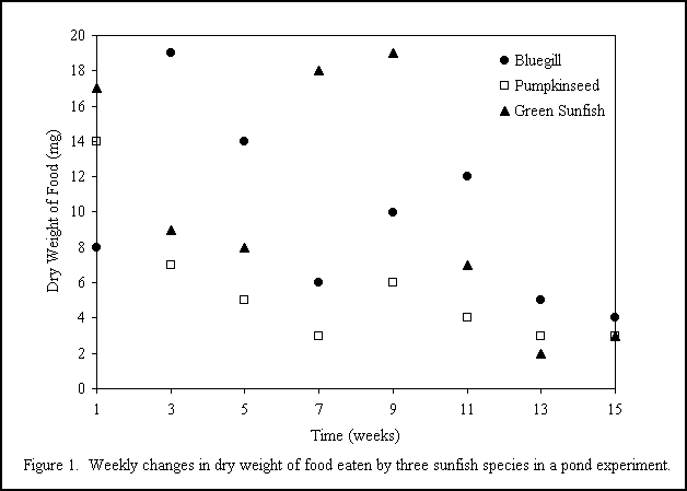
How the scatterplot
in Fig. 1 was created:
| 1. Setting up the data | The
data was set up as shown in the Fig. 1 data worksheet (download and examine
the figures.xls file). In this example there
is one set of x-values (Column A with the weeks) and three sets of y-values
(Columns B-D). Your data set may be less elaborate. But you must have one
column of x values and at least one column of y values.
Remember: the x-axis (horizontal line) represent the independent or manipulated variable, and the y-axis (vertical line) represent the dependent or responding variable. |
| 2. "Selecting" the data | Click on cell A1 and drag the mouse diagonally from cell A1 through cell D9. The entire batch of cells in this worksheet should now be highlighted. |
| 3. Inserting the chart | Use the Insert-Chart command. Select the XY (Scatter) chart option and click Next and then click Next once again to advance through various options. |
| 4. Setting the titles and omitting the gridlines | Click
on the Titles tab and type in this information:
Value (X) Axis: Time (weeks) Value (Y) Axis: Dry weight of food eaten (mg) Click on the Gridlines tab and uncheck the Major gridlines box Place the chart as a new sheet and click Finish. |
| 5. Adjusting the plot area, symbol colors, etc. | Double
click anywhere inside the plot area. The following settings were used:
Weight (of the border line): select the second line option Area: select none Click OK
Background color: black Click OK |
| 6. Removing the line around the legend box | Carefully
double-click on the borderline surrounding the legend box.
Select None for the border. Click OK |
| 7. Moving the chart elements around | Drag
the plot area up just below the Figure 1 chart title.
Drag the chart title down below the plot area. (Figure captions go below the figure.) Resize the plot area to your satisfaction by clicking on the plot area and dragging the little black squares on the border of the plot area. Drag the legend box into the upper corner of the plot area. |
| 8. Specifying a new font type and size | Click
anywhere outside of the plot area so that little black squares appear around
the entire chart.
In the menu bar, select the Format-Selected Chart Area , and then click on the Font tab. In this example, the Times New Roman, size 12 font was selected. Note: You may select individual titles (for example, the x-axis title) and adjust their font size, color, etc. as you wish. |
| 9. Other comments | You undoubtedly
noticed numerous opportunities for tweaking color, font size, etc. These
are all options that you may want to experiment with.
Note: One useful option Excel offers is to draw linear regression lines and calculate and display regression equations and R2 values. This is doing using the Chart-Add Trend line option. |
A line graph
is similar to a scatterplot except that successive points are connected
with a line as shown in Fig. 2.
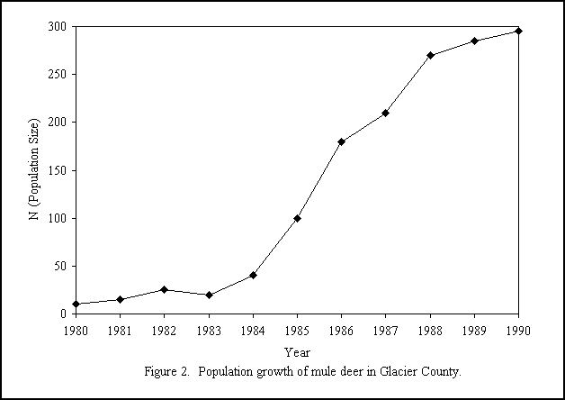
How Fig. 2
was created:
| 1. Setting up the data | Open the figures.xls file and look at the Fig. 2 data worksheet. (Unless you have already done so, download this file.) Starting with cell A1, drag the mouse diagonally from cell A1 through cell B12. The entire batch of cells should now be highlighted. |
| 2. Inserting the chart | Use the Insert-Chart command. Select the XY (Scatter) chart option and then click on the lower left chart option (shows straight lines connected the dots). Click Next and then click Next once more. |
| 3. Setting the titles and gridlines | Click on
the Titles tab and type in this information:
Value (X) Axis: Year Value (Y) Axis: N (Population Size) Click on the
Gridlines tab and uncheck the Major gridlines box.
Place the chart as a new sheet and click Finish. |
| 4. Adjusting the plot area and symbol colors, etc. | Basically,
this works the same as it did in the scatterplot example.
Double click inside the plot area. The following settings were used:
Weight (of the border line): select the second line option Area: select none Click OK
Foreground color: black Background color: black Click OK |
| 5. Rearranging the chart elements | Drag the
plot area up just below the Figure 2 chart title. Drag the chart title
down below the plot area. (Figure captions are usually placed below the
figure.)
Resize the plot area to your satisfaction by dragging clicking on the plot area and dragging the little black squares on the border of the plot area. |
| 6. Changing the font size and type | Click anywhere
outside of the plot area so that little black squares appear around the
entire chart.
In the menu bar, select the Format-Selected Chart Area , and then click on the Font tab. In this example, the Times New Roman, size 12 font was selected. |
| 7. Changing y-axis from linear to log scale | In some situations
you may want one of the axes -- say the y-axis -- to be changed to a log
scale. This may be done using Fig. 2 as an example.
First, double click on the y-axis line. In the dialog box that pops up, change the minimum value to 1, set the "Value (X) axis crosses at" to 1, and check the "Logarithmic scale" box. Then click "OK." |

How Fig. 3
was created:
| 1. Setting up the data | The data sheet was set up as shown in the Fig. 3 data worksheet (look in the figures.xls file -- download if necessary). In this example there is one set of x-values (the column with nutrient treatments) and two sets of y-values (one for Species A and one for Species B). The fourth and fifth columns list the 95 percent confidence limits for Species A and Species B, respectively. Your data may not have confidence limits, so these columns may not pertain to your situation. Starting with cell A1, drag the mouse diagonally from cell A1 through cell C4. The first three columns of cells (but not columns D and E!) should now be highlighted. |
| 2. Inserting the chart | Use the Insert-Chart command. Select the Column chart option. Click Next and then click Next once more. |
| 3. Setting the titles and omitting the gridlines | Click on
the Titles tab and type in this information:
Value (X) Axis: Nutrient Value (Y) Axis: Percent Increase Compared to Control Click on the
Gridlines tab and uncheck the Major gridlines box.
Place the chart as a new sheet and click Finish. |
| 4. Adjusting the plot area, font size, bar patterns, etc. | Double click
on inside the plot area. These settings were specified:
Weight (of the border line): select the second line option Area: select None and then click OK To get the striped bars double click on one of the Species A bars.
Area: click on Fill Effects Click on the
Pattern tab and then on a striped pattern.
|
| 5. Error bars (may not be relevant to your needs) | Double click
on one of the Species A column bars, and then click on the Y Error Bars
tab.
Click on the Custom button, then go to the Fig .3 data worksheet, and drag the mouse from D2 through D4. Click OK. Repeat, using one of the Species B bars, except drag the mouse from E2 through E4 on the Fig. 3 data worksheet. |
| 6. Rearranging the chart elements | Drag the
plot area up just below the Figure 3 chart title.
Drag the chart title down below the plot area. (Figure captions are usually placed below the figure.) Resize the plot area to your satisfaction by dragging clicking on the plot area and dragging the little black squares on the border of the plot area. Finally, drag the legend into the plot area. |
| 7. Adjusting font size and type | Click anywhere
outside of the plot area so that little black squares appear around the
entire chart.
In the menu bar, select the Format-Selected Chart Area , and then click on the Font tab. In this example, the Times New Roman, size 12 font was selected. |
D. HOW TO INSERT AN EXCEL CHART INTO A FILE MADE WITH ANOTHER SOFTWARE APPLICATION
Once you create
a figure in Excel you may want to simply print it and then staple it to
the end of a document you are writing. Or you may copy the figure from
Excel and paste it into a file you are creating in another software application
such as Word, Word Perfect, or PowerPoint. The following steps demonstrate
how an Excel chart can be pasted into a PowerPoint file.
| 1. Create a figure using Excel | See previous guidelines. |
| 2. If the figure is to be inserted into PowerPoint, you may want to make the figure look colorful and attractive | Experiment with different background colors, marker colors, and font formats. Be sure to use colors that will project clearly and legibly. For example, figures with yellow lines project poorly. Note: If the figure is for a research manuscript, it is customary to stick with plain, simple, black and white formatting. |
| 3. Resize the plot area so that it fills most of the chart window | Click inside the plot area and use the mouse to drag on the little black boxes around the plot. |
| 4. If used in PowerPoint, make sure that all font sizes are at least 18point (or larger) | If the font size is too small, words may be illegible to the audience. |
| 5. Copy the chart | Click anywhere outside of the plot area so that little black squares appear around the entire chart border. Then use the copy command (control-C or Edit-Copy). This will place a copy of the figure into the computers memory. |
| 6. Open a PowerPoint file and insert a blank slide | Then use the paste command (control-P or Edit-Paste). This will paste the Excel figure onto the blank slide. |
| 7. Resize the figure | Drag on the figure corners. |
| 8. Experiment! | You may download a sample PowerPoint file (powerpoint example.ppt) that demonstrates what a final product might look like. |
Back to Research Manuscript page
Copyright © 2001, the University of Wisconsin-La Crosse and the Board of Regents of the University of Wisconsin.